ART BTEC Header

ART BTEC Header

Monday 22 October 2012

A few pointers with the 3D work:
  • Try to move away from purely literal interpretations of your letterforms. Look at your 2D work and pick out shapes created by the spaces between letters (negative spaces) and use sections of letters, rotate and invert to make interesting forms.
  • Once you have a few elements constructed take visual stock of what you have. Look at your work from a number of angles to assess how visually successful your relief is. Your next decisions should be led by what you feel your piece needs e.g.:                                                                                    "It looks unbalanced, so I need to add height to the left hand side"               "I need some larger sweeping forms that travel through my relief to unify different sections"                                                                                        "I need to repeat the disc form to create visual links between areas of my work" etc.
  • Remember the quality of your making is really important. Cut the grey card carefully in layers, score evenly if you are making curved forms. Try to use slots and interlink elements to minimise or eliminate the need for glue or tape.
Over the rest of this week you will be finishing and photographing your relief pieces, and producing some plan drawings towards the creation of a fully 3D sculpture that we will undertake in the first week back after half term.
The week after half term is the last week of this project, so it is important that you use half term to get fully up to date with all the work we have tackled so far.
Over half term we also want you to prepare for the next stage of your work by researching two of the following sculptors (background information, several good images of their work and some personal analysis, minimum 4 pages of carefully presented research): 
Eduardo Chillida

David Smith
Naum Gabo: Head No.2
Naum Gabo

Richard Deacon, Read Sea Crossing
Richard Deacon

Anthony Caro


Friday 19 October 2012

Into 3D!

Over the last couple of days there has been some really exciting photography and your first experiments moving towards 3D look great.
Next week we will work on creating some more substantial relief pieces and moving towards more abstract forms.
In addition to the previous list the following items you covered with Charmian should be completed for Monday. We'll have a sketchbook review, and it would be good to see some really significant progress since last week.
I'm hoping to see some really good research as this was noticeably absent last week, it is essential you have looked at Frank Stella's relief sculptures as these will really inform what we are doing next week. Also get the photos you've been taking printed and into your books.
So add these to the list:
  • At least 8 good photos of lettersforms in the photobooth, using the lightbox, and capturing strong compositions, dramatic shadows, angles, zoom-ins etc. Printed out and mounted in your book.
  • 1 curled typeface cut out piece and good dramatically lit photos of it.
  • At least 1 white card relief composition.

Tuesday 16 October 2012

ALPHASEMBLE UPDATE

First the good news - having marked your Tools sketchbooks I was really impressed with the standard of work and the amount you all achieved over the 2 weeks we dedicated to this project. Well done!
There does seem to have been a hangover effect from this though and having had a look at progress with the current project this morning it is apparent there is a lot of catching up to be done. The lack of research was a particular concern. We'll have another sketchbook review at the start of next week - with a decent private study effort this week I'm certain we can get back on target. An updated "To Do" list is included below, you need to get stuck in and get this work done by Monday 22nd October.
This project offers a great opportunity to be inventive, carry a camera with you and keep snapping whenever you see interesting examples of letterforms around you.

FOR TOMORROW: Find or create 2 letters/numbers that are between 10 and 20cm in height. At least one of these should be made from a rigid material. Bring CAMERAS.

To Do List (for Monday October 22nd):
  • At least 2 pages where you compile examples of your 5 selected letters and 2 numbers. Try to collect examples from a range of sources e.g. Newspapers, magazines, font websites. Lay out each of these pages in a dynamic way. Mix up font sizes, overlap and collage your letters down, consider copying some letters onto acetate for overlaying.
  • 2 A3 Linear overlay letter compositions (similar to work by Jasper Johns).
  • Photocopies of your Linear pieces worked into with tone and pattern.
  • Photocopies of your Linear work or prints worked into with coloured inks and bleach.
  • Photocopier inverts of your letterform compositions.
  • An A3 Gold Card with several prints from it.
  • Research into the letter/number paintings and drawings of Jasper Johns (2 pages).
  • Research into either the Typographic work of David Carson, see http://www.davidcarsondesign.com/t/ or the letterform work of Michael Craig-Martin, see http://www.michaelcraigmartin.co.uk/ scroll through the most recent work (2007 - present).
  • Photographs of your chosen letters and numbers - you should aim to find at least 2 examples of each one in the environment around you. One found (e.g. on a sign, notice, advert, vehicle) and one created (by arranging objects of your choice to represent the letter/number). Look at http://www.typeworkshop.com/ for inspiration (search the archive).
  • Photos of your collected/made letterforms on the lightbox.
  • At least 2 PhotoShop developments from your existing work. Scan images, but add more text layers to create complex compositions.
  • Research into the 3D relief work of Frank Stella (2 pages, get a range of images, a little background information and a couple of paragraphs of personal analysis of specific pieces).
Frank Stella

Friday 12 October 2012

Alphasemble Update

It has been good to see you making a positive start to the new project, many of your initial letterform compositions really look good.
The work you should have complete for the start of next week (Monday 15th October) is detailed below, remember if you want to meet final deadlines for projects that meeting interim work targets is important.
  • 7 pages where you compile examples of your 5 selected letters and 2 numbers. Try to collect examples from a range of sources e.g. Newspapers, magazines, font websites. Lay out each of these pages in a dynamic way.
  • 2 A3 Linear overlay letter compositions (similar to work by Jasper Johns).
  • Photocopies of your Linear pieces worked into with tone and pattern.
  • Photocopier inverts of your letterform compositions.
  • An A3 Gold Card plate cut and ready to print.
  • Research into the letter/number paintings and drawings of Jasper Johns (2 pages).
  • Research into either the Typographic work of David Carson, see  http://www.davidcarsondesign.com/t/ or the letterform work of Michael Craig-Martin, see http://www.michaelcraigmartin.co.uk/ scroll through the most recent work (2007 - present).
Michael Craig-Martin

David Carson

  • Photographs of your chosen letters and numbers - you should aim to find at least 2 examples of each one in the environment around you. One found (e.g. on a sign, notice, advert, vehicle) and one created (by arranging objects of your choice to represent the letter/number). Look at http://www.typeworkshop.com/ for inspiration (search the archive).
Type Workshop

Monday 8 October 2012

First Tasks for the New Project

For tomorrow's lesson you need to come with the following:
  • £2 for an A3 sketchbook.
  • A range of drawing pencils, sharpener, eraser.
  • Black biro (or fineliners if you have them).
  • A range of letterforms to work from (see below).
In terms of letterforms you need to choose 5 letters and 2 numbers and bring 5 examples of each one (so that is 35 examples in all). Get your examples from a range of sources - newspapers/magazines/websites like www.dafont.com

You should also be starting your research by looking at the number and letter based drawings and paintings by the American Artist Jasper Johns. 2 pages with some background information, good reproductions and some thoughtful personal analysis and opinion.

Jasper Johns

Jasper Johns

Sunday 7 October 2012

New Project Brief - Alphasemble


BTEC Extended Diploma 1st YEAR PROJECT BRIEF

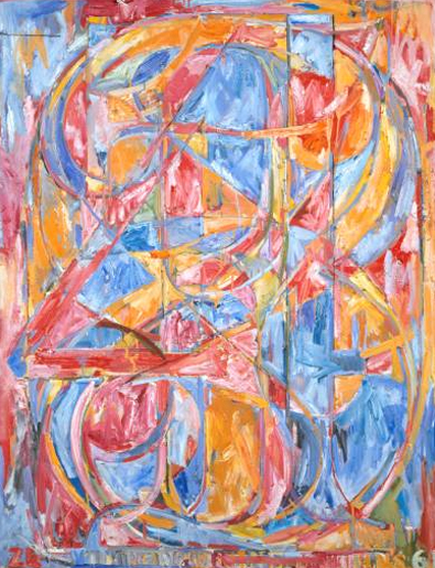
PROJECT: ‘Alphasemble’, 
Specialist: 3 Dimensional Design/Sculpture

Project Outline:
This project presents an opportunity to further develop your drawing, printing and mark-making skills, to come to a better understanding of colour and composition and to work in both controlled and expressive ways.  It also offers the opportunity to manipulate materials in the process of exploring 3 dimensional forms. 

This project is divided into two sections. The first requires you to work in your sketchbooks to explore 2-dimensional space, form & line, layered shapes, mark-making, surface quality, colour, composition & layout and to develop an awareness of good design and composition using letterforms and different typefaces as a starting point

The second requires you to interpret your 2 dimensional designs/ images into 3 dimensional forms using abstraction and to explore the language, techniques and materials of 3 -dimensional design (3DD) and sculpture.

In both sections you will study various artists in order to enhance your working practice and place the project into a relevant historical context.
 
Materials, equipment & resources

Pencil, fine-liner, biro, paint, pastel, collage, photo-shop, photocopy, acetate, food-dye, ink, bleach, spray paint, relief printing.
Card, paper, wire, glue guns etc.

Artist Research: Jasper Johns, Frank Stella, David Carson, Michael Kenny, Michael Craig Martin, Frank Gehry, Naum Gabo, Lazlo Maholy-Nagy, Philip King, Richard Deacon, Eduardo Chillida, David Smith, Santiago Calatrava.

Resources:  Fonts - www.dafont.com, www.font.com, www.font101.com etc.  Modern Sculptors: www.sculpture.org


PART 1: Week 1

  • Start by choosing 5 or more different letters from your name. Begin to research into a variety of different type-faces and collect examples of these: Use websites, magazines, newspapers, computer fonts etc.
  • Using pencil/fine-liner/biro or pen & ink, experiment with the letterforms as compositional elements to produce several different designs/images.  Start by using the letter outline only and create several overlay examples (see Jasper Johns numbers).
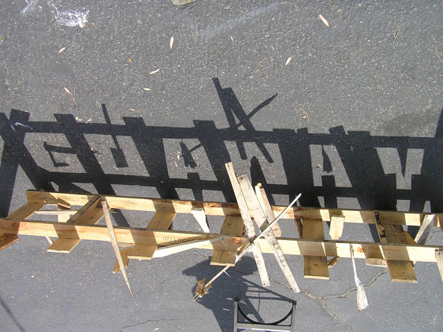
  • Get out and see where you can see or create letterforms in the environment, record your discoveries through photography.
  • Next explore more ideas based on your selected typeface/letters by considering the following: changes of scale, symmetry & non symmetry, positive and negative shapes and close cropping so that only part of the letter form is visible.
  • Now start to play with some of this imagery by working into the negative and positive shapes with different types of mark making to create lively and interesting surface effects and a sense of depth and perspective. Your surfaces could be very expressive with an emphasis on fine art painting/ collage mark making etc or they could be more graphic.  Look at repetition and pattern, or combine both. An illusion of space can be created by considering the scale, weight and density of marks, and their relationship to areas of solid and void.
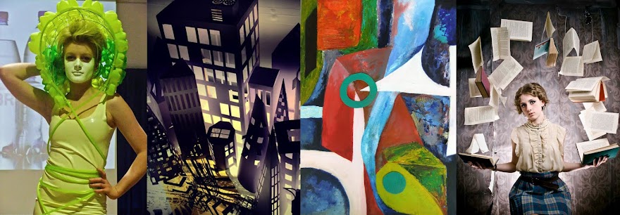
  • Produce research into Jasper Johns and either Michael Kenny or David Carson. Your research should be presented carefully over several sketchbook pages, find images of the Artists work and analyse these alongside providing background information and visual responses for each Artist selected.

Week 2
·      Select the strongest of your drawings and start to introduce colour. You may work on the whole design or take a section and enlarge it.  Explore the use of the following colour mediums: paint, oil pastel, food dye & bleach and mixed media collage. You will be shown any new techniques as you progress.
·      Explore your compositions by devoting some time to cutting and printing a detailed gold-card relief print.
·      Now take the development further: photocopy some of your images onto paper and acetate; play with scale, inversion etc. Look at cutting away, layering and overlay to create collages. Scan some of your images into the computer and manipulate further using PhotoShop.

Part 2: Week 3

·      Select two or three of your strongest ideas/ designs. Start by identifying some of the formal elements of your images - i.e. both positive & negative shapes that represent the whole or parts of the letter forms you have been looking at.
·      Look at the work of Frank Stella and one other sculptor from David Smith, Eduardo Chillida, Naum Gabo and Richard Deacon produce research that analyses specific works by these sculptors and includes your own visual responses to their work.
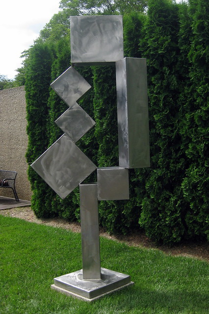
·      Having looked at the work of Frank Stella use strong shapes from your drawings/designs cut-out, raise and interlock shapes to produce a ‘relief’ version of your image.
·      Begin exploring how to interpret these 2D images into 3D forms using twisted, torn and scored paper combining these with cardboard. You will also be expected to introduce colour and surface into your maquettes. As you progress you will probably need to sketch out some of your ideas in your sketchbook to help resolve ideas and problems.
·      You will need to carefully consider negative as well as positive space.  By the end of this week you should have at least one successfully resolved relief piece as well as 3D experiments that will help you to move onto the production of a final sculptural piece.
·      Take some dynamic photos of your maquettes using strong light and interesting viewpoints and angles. Include close up details as well as views of the entire piece.

Week 4

·      You are now expected to produce a final, well finished 3 dimensional piece that will demonstrate a refined application of the materials and techniques that you have experimented with in the previous week. You will need to pay special attention to scale, surface (colour and texture) and ensure that your final piece works well from all angles. This sculpture should be no larger than 40cm in any direction.
·      Ensure you obtain good photographs of your final piece and include these in your sketchbook. When taking these photos you should use a plain clean background and again consider lighting, viewpoint, details etc.
·      Complete a word-processed project evaluation (further guidance on this will be issued)

Minimum submission requirements:

·      1 x sketchbook packed with ideas, drawings, experimentation and that shows the development of your ideas.
·      Also in sketchbook: research into letterforms type-faces etc, relevant artist/sculptors etc. A series of photos of your maquettes and final 3D outcome.
·      Relief sculptural piece, plus any additional 3D experiments.
·      A final sculptural piece.
·      A word-processed evaluation.


Friday 5 October 2012

Tools Evaluation

TOOLS PROJECT EVALUATION


In order to pass this project, you will need to write a short evaluation.  This will clearly define the processes and techniques you have investigated, as well as outlining any high moments and low moments.

·        Begin by giving a brief outline of the project – describing what you were being asked to do.
·        Talk about why you selected your particular tool, i.e., what design and drawing opportunities it could offer you. You could talk about the range of pencil grades you needed to use in order to record it accurately & the individual shapes within the object that you could isolate and use within your experimental pieces.
·        Talk through all the different processes you encountered, keeping it brief & informative, which were the most successful in your view, & how have your existing skills been extended in the process.
·        Talk about the artists you researched, why they were relevant and how you used what you learnt about them in your own work.

You should, all through this evaluation, analyse each step, talk about how successful it was & how you might improve upon it.

This should be 400-600 words, included in your sketchbook and word processed.

Tuesday 2 October 2012

List of Techniques to cover

Robert Rauschenberg


A list of all the techniques you should have covered (and have evidence of in your sketchbook) before the end of the project:
  • Tonal pencil drawing.
  • Photography.
  • Stick and Ink drawing.
  • Charcoal drawing.
  • Collage base drawing.
  • Photocopier invert.
  • Monoprinting.
  • Relief (gold card) printing.
  • Spray stencil.
  • Acetate collage.
  • Coloured Inks and bleach.
  • PhotoShop.
You will need to have a little money for acetate tomorrow (available in the LRC for 20p a sheet).

During this project the time factor means there is limited opportunity to combine the techniques we have tackled, but in terms of your future work this is one of the most important things to do. Some of the best student work comes from layering the methods to create rich and complex images. One Artist who is a master at combining media and techniques is Robert Rauschenberg.

So in addition to the drawings of Jim Dine and the collage work of Florian Nicolle you should also complete your research by looking at the mixed media work of Robert Rauschenberg.

Monday 1 October 2012

Creating a Spray Stencil


1. Take an image with strong contrasts, this can be a photo, drawing or a print.
2. Scan or open the image in PhotoShop.
3. Simplify the image by applying the threshold effect (found on the Image drop down menu), slide the scale to adjust the black/white balance.


4. Print out your "Threshold" image on paper and then photocopy it onto acetate. You will need to use the manual feed tray on the right of the photocopier for your acetate, make sure you select the "transparency" option.
5. Use the black areas as a guide to cut away your stencil. Beware of cutting completely around areas so your acetate does not fall apart. You may have to leave tabs/bridges around areas to keep your stencil intact.
6. Once your stencil is cut you are ready to spray, make sure you use one of the spray booths.